Ink 3 is available today. Ink lets you build command-line apps using React and have fun while doing so too.
Ink is a special project to me, because it’s been surreal to watch how a tiny experiment grew into a full-featured command-line UI toolkit that’s used by Gatsby, Parcel, Yarn, Terraform, tap, Prisma, Shopify, New York Times and many others. I had no idea it had such a great future when I was just playing with React trying to make it render things to a string and output it in the terminal.
I’m excited to share all the updates with you, so let’s dive right in to see what Ink 3 has to offer.
Stability and Performance
While it’s not so much of a feature, I think it deserves a top spot. People loved using React to declaratively build UIs for their command-line apps, but sometimes it ended up hurting their end performance. For example, Gatsby noticed their build process slowed down, which is obviously not the tradeoff I want Ink’s users to accept.
Ink 3 got rid of quite a few rendering bugs and in some cases I observed a 2x performance improvement when there’s a high frequency of re-renders. Text rendering and the whole support for Flexbox was rethinked from the ground up and rewritten. It’s also much simpler than it was before, which makes issues easier to debug, reproduce and solve.
Previous version of Ink had multiple hacky workarounds for various layout issues, so it didn’t always render what you would expect. Ink 3 should be a significant improvement in that area.
Colors in <Text> component
Previously you had to use a separate <Color> component for applying color to text.
This could quickly get noisy:
<Color red>
	<Text bold>Hello World</Text>
</Color>
In Ink 3, all functionality from <Color> component was merged into <Text> and simplified.
<Text bold color="red">
	Hello World
</Text>
If your terminal supports extended range of colors, you can even use HEX or RGB colors.
<Text color="green">Green</Text>
<Text color="#005cc5">Blue</Text>
<Text color="rgb(232, 131, 136)">Red</Text>
Text can also have a colorful background by setting the backgroundColor property, which accepts the same values as color.
<Text color="black" backgroundColor="green">
	Black on Green
</Text>
Learn more about <Text> component.
Borders
Boxes can have stylish borders now! Fun fact, this feature unexpectedly uncovered a range of layout issues in Ink. I noticed how borders were rendered incorrectly around boxes and uncovered how box dimensions differ in Ink and Yoga, which sparked a rewrite of the entire rendering flow.
<Box
	borderStyle="round"
	borderColor="green"
	paddingX={1}
	flexDirection="column"
>
	<Text color="green">New version is available!</Text>
	<Text>
		Run <Text color="blue">npm i -g my-cli</Text> to update
	</Text>
</Box>
Oh, and there are 7 border styles in total, so you can pick the one you like the most.

Learn more about borders.
Hooks all the way
Ink 3 offers a set of powerful hooks to manage your app:
useInput- Read user input.useApp- Exit app.useStdin,useStdoutanduseStderr- Direct access to stdin, stdout and stderr streams.useFocusanduseFocusManager- Focus management (more on that later).
I want to mention useInput in particular, because it has seen significant improvements since Ink 2.
Now it parses user input more reliably and can properly detect when user presses combinations of keys, like Shift + Tab for example.
If it wasn’t working properly for you before, I encourage you to give it a try again.
Learn more about built-in hooks.
New <Static> component
If you need to render unpredictable and possibly large number of items, use <Static> component.
Think of <Static> as a terminal-specific implementation for a virtual list technique, where only necessary items are rendered.
<Static> renders all new items above the rest of your UI permanently, which means you can’t update them once they are displayed.
This makes <Static> a perfect candidate for tools like Jest, where hundreds of completed tests could need to be logged.
<Static items={['Test #1', 'Test #2', 'Test #3']}>
	{(test, index) => (
		<Text key={index} color="green">
			Completed {test}
		</Text>
	)}
</Static>
In Ink 3, <Static> is almost twice as performant as it was before and API has been simplified to match libraries like react-tiny-virtual-list.
Here’s an example of a UI similar to Jest, where completed tests are rendered using <Static>.
Learn more about <Static> component.
Support for React Devtools
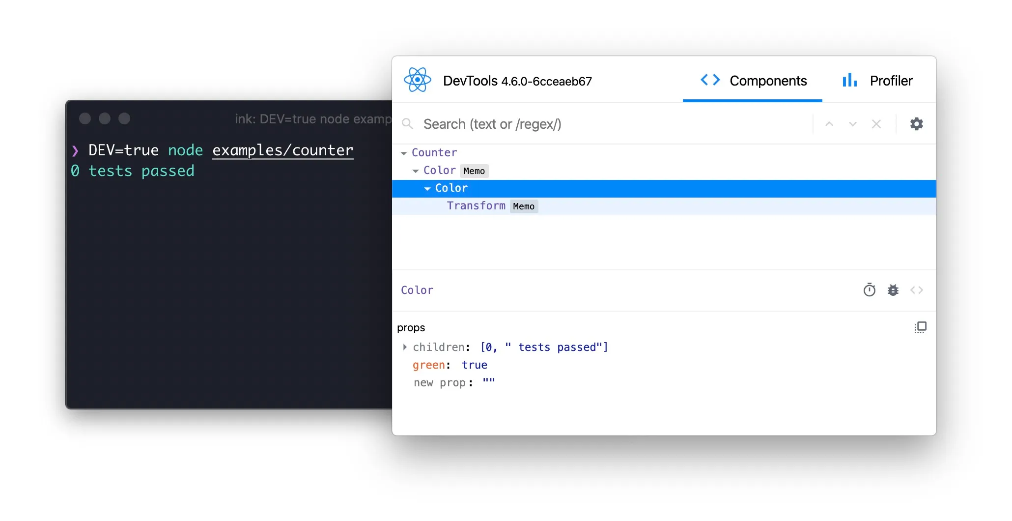
Yes, you read that right. You can use React Devtools to inspect the output of your Ink app. The magical bit is that you can actually change the props of any component and see your CLI update on the fly without having to restart it.

You don’t need to make any changes to support it, just set DEV=true environment variable and open Devtools:
$ DEV=true node examples/counter
$ npx react-devtools
Built-in error handler and log interception
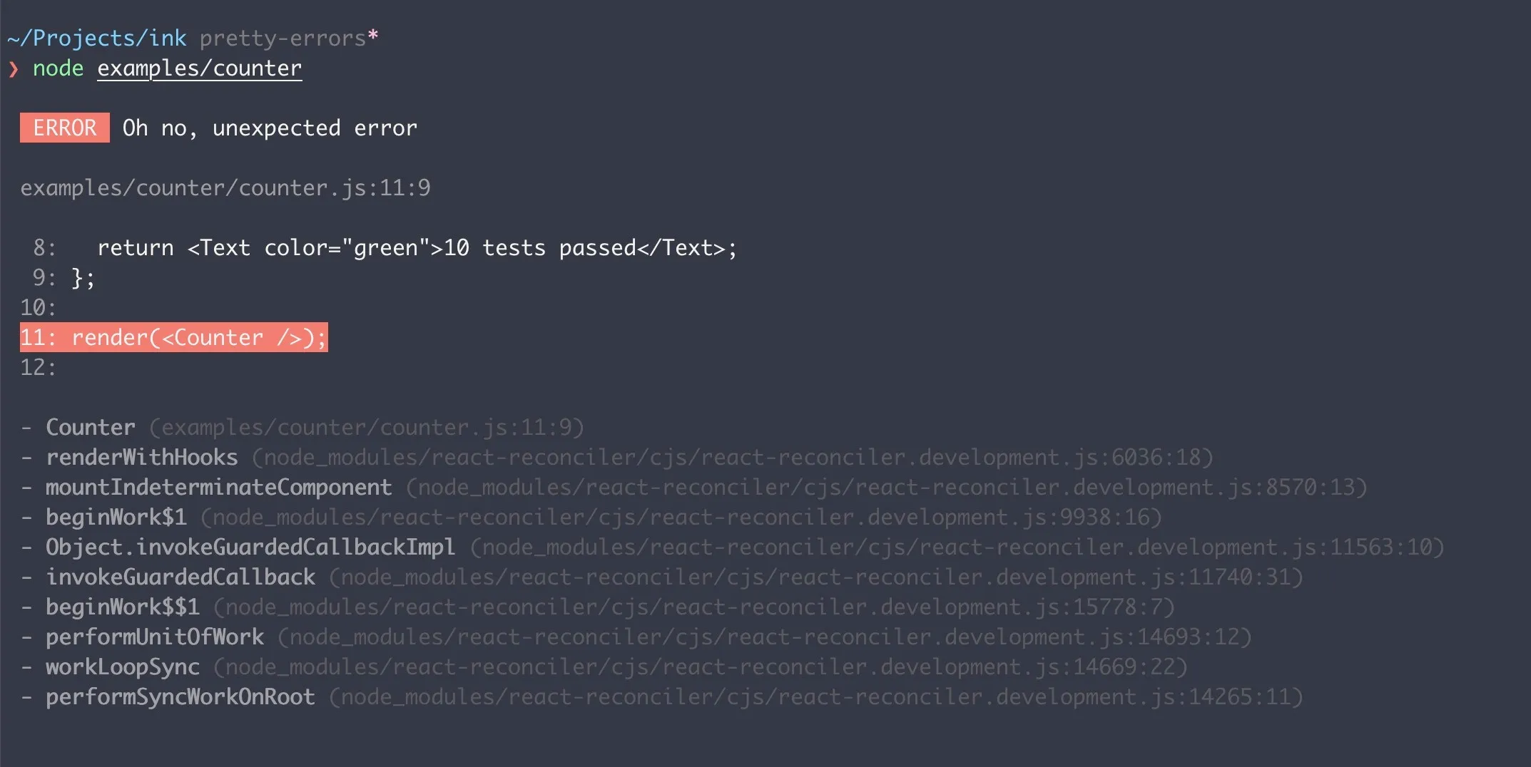
When one of your components throws an error, React displays a quite verbose error message to the console and a long stack trace. Most often that stack trace isn’t super useful, because it points to React internals.
Ink 3 offers a simpler and cleaner solution to this problem by defining a global React error boundary and rendering a beautiful overview of the error.

To improve developer UX further, Ink 3 intercepts calls to console.log, console.error and other methods to ensure logs are displayed correctly above your app’s UI and not interfere with each other.
This is necessary, because Ink re-renders your UI all the time, which can overwrite the output from console.log.
Focus management
If your app has more than one user input displayed at once, it can become tricky to detect which input has the focus and should receive data. To make this easier, Ink offers two new React hooks:
useFocus- Receive focus.useFocusManager- Manage focus programmatically.
When component calls useFocus hook, it notifies Ink that there’s a new focusable component in the UI.
Each time user presses Tab, Ink is going to pass focus to the next focusable component in the queue.
const First = () => {
	const {isFocused} = useFocus();

	return (
		<Text>
			{isFocused ? 'First item is focused' : 'First item is not focused'}
		</Text>
	);
};

const Second = () => {
	const {isFocused} = useFocus();

	return (
		<Text>
			{isFocused ? 'Second item is focused' : 'Second item is not focused'}
		</Text>
	);
};

const Example = () => (
	<>
		<First />
		<Second />
	</>
);
In the example above, as user presses Tab, focus will be passed back and forth between First and Second components.
When your app needs to manage focus manually, without waiting on user input, you can use useFocusManager hook.
It lets you switch focus to the next or previous component or turn it on/off completely.
Learn more about focus management.
New <Spacer> component
<Spacer> component is a handy box, which automatically expands to fill all the available space.
It’s quite similar to the one built into SwiftUI.
In the following example, “Left” and “Right” labels will be pushed to the sides, because <Spacer> fills the space between them.
<Box>
	<Text>Left</Text>
	<Spacer />
	<Text>Right</Text>
</Box>
Similarly, when container has a column direction, <Spacer> will expand vertically instead.
<Box flexDirection="column" height={10}>
	<Text>Top</Text>
	<Spacer />
	<Text>Bottom</Text>
</Box>
New <Newline> component
<Newline> component is basically a replacement for manually inserting one or many \n characters.
Note that it can be used only inside <Text> components.
<Text>
	Hello
	<Newline />
	World
</Text>
If you need more than one newline character to be inserted, add a count property:
<Newline count={3} />Thank you!
Lots of great companies and developers already use Ink to build their CLIs and I can’t wait to see what you come up with this next generation of Ink! For those who are interested in migrating from Ink 2, there’s a migration guide available.
I want to say thank you to everyone who has contributed to Ink 3 and helped by testing the pre-release version to make sure final release is as bug free as possible ❤️
Special thanks to:
- Sindre Sorhus for constant help & feedback.
- Taras Mankovski for converting the entire codebase to TypeScript.
- Julien Deniau for his focus management work.
Check out the new Ink on GitHub.